Monday, 25 September 2017

Cultivation Theory-George Gerbner

Cultivation Theory-George Gerbner
- His theory follows the idea that exposure to repeated patterns of representation over long periods of time can shape and influence the way in which people perceive the world around them for example (cultivating particular views and opinions). Specifically whether watching television influences the audiences idea and perception of everyday life.
- He believes that cultivation reinforces mainstream values.
- His ideas are that media messages aren't directly injected into the passive media audience but they are built up by a series of repetition and enforcing of the message.
- He states that high frequency viewers of television are more susceptible to media messages and the belief that they are real and valid
- The Cultivation Theory suggests that "The more you look at television, the more you are likely to believe in the reality of the representation".   

Hypodermic Needle theory

Hypodermic Needle Theory
This is a theory used as an attempt to explain how audiences act towards media. It suggests that audiences passively receive information via media text and the audience would not challenge or process the information. This theory reached popularity when mass media was very new and mainly used in propaganda.
 This theory implies that mass media has a powerful and direct effect on audiences. This suggests that the media works like a drug and the audience is addicted to the effect. 


Media Effects- Albert Bandura

Albert Bandura- Media Effects
- Albert Bandura formed the idea that media can implant ideas in the mind of an audience directly.
- He also portrays the idea that audience acquire attitudes, emotional responses and new styles of conduct through modelling.
- He believes that media representations of transgressive behaviour (violation of moral or social boundaries)such as violence or physical aggression, can lead audience members to imitate those forms of behaviour.
- He argues that violence is prevalent in the media and exposure to various forms enables us to perceive violence as an acceptable way to deal with situations- Bandura called this 'modelling' behaviour.
 
- Children observe people around them behaving in various ways eg. Bobo doll experiment.
 
 Bobo doll experiment
In this experiment in 1961, 24 children (12 girls,12 boys) watched a male or female model behaving aggressively toward a toy called the 'Bobo doll'. The adult model attacked Bobo using a hammer or throwing the doll around and kicking it.
 
The children then abused the doll with the same treatment. This showed that children copy behaviour from models they witness (individuals that are observed are called 'models')
 
In society, children are surrounded by many influential models such as parents within the family, characters on children's TV programmes or friends in peer groups. Each model provides examples of behaviour to observe and imitate. 
 
- Examples of Bandura's theory currently are video games. These games can have a large impact on young children's behaviour. If young teenagers are playing these games on a daily basis, then the war and violence games are going to have an effect on them/. Therefore they might start to think that violence is normal. 
   

Audiences and Media Texts

Audiences
 
-Genres are used to appeal to a specific audience.
-Audiences seek out genre.
 
Media Texts:
- Generate money
- Attract as large an audience as possible
- Subscription services use pay monthly schemes to generate money.
- Media texts are used to bring in advertisers and therefore generate money.


Friday, 22 September 2017

Stuart Hall Theory

Stuart Hall- Reception Theory
 
Intended message- Dominant- Negotiated- Oppositional
 
Stuart Hall is a cultural theorist. He looked at the role of audience positioning in the interpretation of mass media texts by different social groups. He came up with three in which we read a media text.
 
Dominant- This is where the reader completely accepts the text, this means that the audience reads the text the way the author intended them to.
 
Negotiated- The reader understands the text but only partly agrees with it. The audience might mentally modify the text to make it suit them individually.
 
Oppositional- The reader does not agree with the text at all and they find it completely unbelievable. This means they reject the reading.  
 

Thursday, 21 September 2017

Audience


Audience- the assembled spectators or listeners at a public event such as a play, film, concert, or meeting.
 
Demographic Profiling
 
A Higher Management, Bankers, Lawyers, Doctors
B Middle Management, Teachers, Graphic designers
C1 Office Supervisors, Junior Management, Nurses, Clerical Staff, White collar jobs
C2 Skilled Manual Workers, Plumbers, Builders, Blue Collar jobs
D Semi-skilled, Unskilled Manual Workers
E Unemployed, Students, Pensioners, Casual Workers
 
Psychographic Profiling
 
Mainstreamers- Seek security. Tend to be domestic, sentimental, value for money family brands.
Aspirers- Seek status. Materialistic, oriented to image and appearance. Typically younger.
Succeeders- Seek control, Strong goals, confidence, work ethic, organisation. Typically higher management and professionals.
Resigned- Seek survival. Rigid and authoritative values, past and traditional, typically older.
Explorers- Seek discovery. Energy and experiences, value adventure. Typically a younger demographic (students)
Strugglers- Seeks escape. alienated and disorganised. Few resources beyond physical skills. Buys alcohol, junk food, lottery tickets. Typically lower demographic.
Reformers- Seeks enlightenment. Freedom of restrictions and personal growth. Social awareness and independent judgment. Anti-materialistic but aware of good taste.

Target Audience- a particular group at which a product such as a film or advertisement is aimed.
Niche Audience- a small, select group of people with a very unique interest.


Tuesday, 19 September 2017

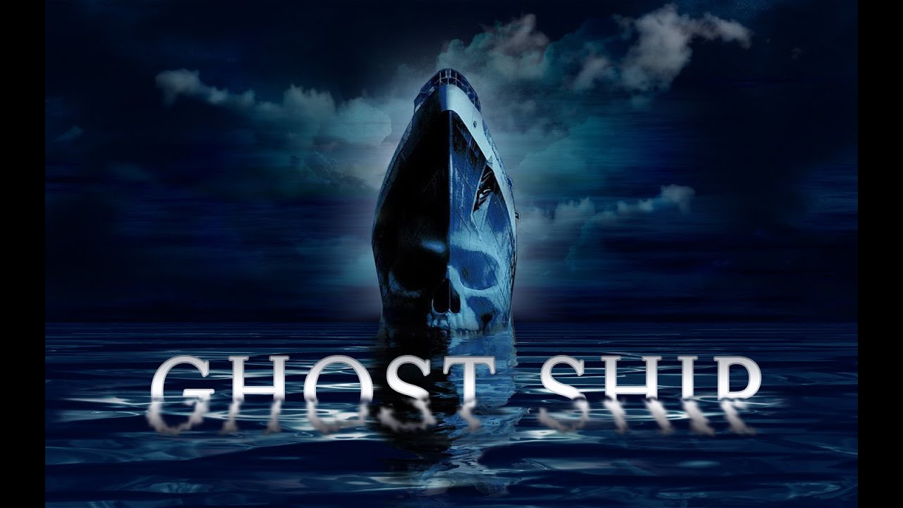
Analysis of Film Opening (Ghost Ship)

 Analysis of Ghost Ship Opening
  In this opening of the film, there are various signs that hint to  the audience what is about to happen.
Firstly in this film opening, the title is in a pink, soft font, this deceives the audience because it makes them think it is either a 
romantic or Disney film. The camera angle circles around the boat as if it is a ghost surrounding its prey. Once you get inside 
the boat, the female singer is wearing a red glamorous dress, this could either connote love and passion or blood and death.
Behind the singer there are males playing the violin and the strings on the instrument could foreshadow the wire that soon
slices the dancers on the rooftop, the producers have given us a snapshot of what is about to come. In front of the vocalist, there is a
waiter who's wearing a slightly regimented waiters outfit, as he is serving champagne to the crowds he has an eye-line match with the
singer which shows that they are hiding something together that no one else knows. Also below deck, there is a limbless statue that appears in a cylinder of water near the dancing stage, this is again a sign that people are soon going to be sliced in half, losing the limbs. When the camera moves to the top deck where the stage is for dancing, the female singers voice is heard through a speaker, this makes the music sound echoed which carries eerie connotations, it is also where the event happens.

Then the camera turns to a young girl sitting down playing a game on the floor, the fact that she is the only child that we see on the boat suggests that she is vulnerable but she appears very innocent as she is wearing a white dress (white connoting innocence). Another factor making her seem exposed is the fact she is sitting in front of flowers; which represent life (that is soon going to be destroyed). the flowers are also red that hints to the massacre of blood that will soon be showed.   
 
In the opening there are many signs that it will be a wire that will kill the people on deck. the first hint is the boat itself because it is straight like the wire. Another hint from the boat is that it looks very much like the Titanic and everyone knows that has a bad ending. The light that beams across the boat could also foreshadow the slicing at the end.


Mise en Scene


                                                  Facial Expression-Meaning
In this image the character appearing on the left (Jude Law) seems as if he has just heard some troubling news and he is trying to process it in his head. His facial expression is quite calm yet pensive. The character on the right has facial expressions that make him look as if he is in a conversation with someone and he is looking at them quite shocked and surprised with what they have just told him.  The moustache on both the characters' face looks quite old and not very modern. 

In the second image, the character on the right looks very serious and looks as if he is concentrating very hard and focussing on what the person on the end of the phone is saying. Whereas the character on the left looks as if he is focussed on something  ahead of him or he is on lookout for something. They both look like they have been running as the characters face on the right is glistening as if he has been sweating,
This image shows the character in the middle looking commanding and in control, he seems to have a very straight face which makes him seem very stern. As the people are grouped around him, it makes them look like they are his followers. A soldier on the bottom left has his hand on his hat which could be a sign of respect to the man's presence. Finally as the middle mans' hands are on his hips, it suggests he has a strong posture suggesting he is not afraid of anything.


                                                      Positioning

In this image, the positioning of both characters is very distant and far apart, this suggests that neither of the characters want to be near each other meaning that they could have previously had an argument. This picture could show relationship problems which could suggest that this film is about relationships and the troubles that come with them.


Within the second image, the positioning of the axe is central in the middle, highlighting that there could be death in this film, suggesting that it is either a horror or thriller film? As the axe is stuck in the plank of wood, it looks like it has already been thrown, perhaps in anger or haste.


In the third image, both characters are positioned close next to each other which could show that they are partners or they work together in a team. The positioning of the guns are slightly tilted upwards and their hands are near the trigger, this could show that they are both about to shoot the guns. The use of guns suggests that this film is either an action or thriller.


In the final image, the positioning of the male standing in the centre suggests that he is the main character. The positioning of his arms suggest that he holds great strength. The army of people around him could either be his army that he is in charge of or they are his enemy that he is trying to battle by himself.


How Does Mise en Scene convey period?

The costumes help to portray period in this picture as the female is wearing a large skirt, the plain clothing suggests she is a servant in the household (presumably to the man on the left). The setting of this image is in a stately house of some kind because there is a slight preview of a large staircase which is often found in large mansions. The statue that appears in the bottom right corner suggests that the house is full of regal people which is normally part of a period show/film/drama.
 What types of lighting are used in these images?
A) High key lighting     B) Low key lighting     C) High key lighting     D)Low key lighting     E) High key lighting  
 F) High key lighting


The lighting used in this image is low key but however the lamp in the image could be high key. The key light in this image is the lamp, the filler lights are in the mirror from the background. The back light could be from the window? The lamp is vital for this image because without it we wouldn't be able to see that the male character has a cut on his face and even what the male characters' facial features are.


I think that this image uses low key lighting. The key light is the streetlight in the background, I feel as if the filler light could be from the reflection on the car and on the man's white tee-shirt. The back light could come from the top left of the image. The streetlight from this image could suggest safety, without the light, neither us or the male character would be able to see anything therefore it would be more scary. The light is also reflected in the drops of rain shooting down from the sky, this could suggest that the rain is a vital part to this scene.

Like the previous image, I feel like it uses low key lighting because you can see shadows on the wall. I think the key light in this image is the light appearing out the door, the filler light could be from above the door. I think the back light is a light we can't see but is reflecting on the back of the two male characters in the bottom right of the image. I feel as if the light in this image is very important because it looks as if there is something vital in the door. As the light is right behind the female character, it makes the audience think that the woman is behind something.

I think the lighting is low key because it is mainly black and white. The key light in this image is the light hanging from the ceiling above the red heart. I think the filler light is the second lamp on the table, then the back light is coming from the window. The lighting in this image is very low key as I feel this accentuates the brightness of the red heart and makes it stand out against the black and white.


Monday, 18 September 2017

Genre pictures

Teen Film-I feel like this looks like a teen because it has the classic locker scene in a long corridor. We decided to create this picture because we used previous films we have watched as examples eg. A Cinderella Story or Mean Girls. I think we could have improved this image by adding another person into it as it could have made the image more believable.                                           
Musicals- I feel this looks like a musical film because it has the piano in it which is a vital part to the genre. It was inspired by other Musical films we have seen eg. High School Musical or Hairspray. This image could have been improved if we took the picture from behind the piano as it would have been easier to identify the genre if we could see the piano keys. Another aspect of the image we could have made better is facial expressions, we should have got a picture which actually included both peoples' expressions.


Crime/Mystery- I immediately know this is a crime image because we know that a crime is being committed as someone is about to be injured or killed. The use of the darkness in the photograph connotes mystery and crime because it is generally something associated with it. This image shows mystery because the character whose about to be hit doesn't know therefore creating suspense. The image could be improved by having a brighter light to have a more defined shadow as it would have made the image clearer.


Friday, 15 September 2017

Analysis of Everything, Everything (intro to genre)


The first camera shot is a height shot of the house, this shows that this is where the majority of the film is set. Then the camera moves into the house tracking the woman (mum) into the house, it almost starts off the journey of the film. The music from the start is a quiet beat with no words, this is when the main character is giving an intro to her life and the film. The music suddenly gets louder and a bit more upbeat as soon as she sets her eyes on the boy she later learns to love. This is an example of synergy because the trailer for the film has used music help promote their product.  Throughout the whole trailer they use high key lighting as the light is always bright, this could be to show the film is uplifting at that there is a positive outcome, if the lighting was dark all the way through it would suggest that the film is negative and perhaps scary or upsetting. The use of text dialogue which shows up on the screen for us is helpful because it gives the audience an insight to what is happening and gives us an understanding to what the film will be like. The girl who has the 'illness' in this trailer always seems tone wearing pale, pastel colours, this portrays her innocence and vulnerability making her a fragile character.

Wednesday, 13 September 2017

Media Vocabulary

Vocab
Genre
Describe
In detail
Setting/location/indoors,outdoors/time of day/weather
Themes- love/revenge/good vs evil/horror
 Icons (significant objects)
Narrative (story line,plot,characters) 
Characters
Textual analysis

Mise en Scene
Costume
Lighting
Actors
Make-up
Props
Setting

Denotations- what is it/what do we see

Connotations-what does it portray/symbolize/what do we understand from an image

Target Audience- means effective marketing communication strategies can be put in place eg. target teenagers by using snapchat.

Mise en Scene- The arrangement of the scenery and props etc. on a theatrical stage or the set of a film


Genre- A style or category of art, music or literature eg. comedy

Semiotics- The study of signs and symbols and their use or interpretation.

Stereotype- Audience instantly understand what they are. Used as a 'visual shortcut'. Stereotypes (images) are repeated many times and are therefore 'normal'.

Archetype- The 'ultimate' stereotype e.g.. white stiletto's big busted, blonde bimbo (Essex woman). 

Counter type- A representation that challenges tradition. 

Representation- The way in which people, events, places and ideas are presented to an audience.

Audience- the assembled spectators or listeners at a public event such as a play, film, concert, or meeting.

Tuesday, 12 September 2017

Semiotics in Film Covers

                                                                                                                                                                                                                                                                                                                             
Semiotics in Bridget Jones's Baby
(Denotations and Connotations)

The female lead is carrying a red iPad case, this carries the connotation of love and passion which is in her hands, she is in control of it and she writes about her love life and displays it in her diary. The woman is holding the iPad tightly, this could connote that she doesn't want anyone else to see it. The tight grip could suggest it is her secret. The fact that the woman is stood in the middle suggests that she is the focus of the film, also the title has her name in a different colour making it vibrant and therefore it stands out. 
Both males are opposite each other on the cover, this highlights their opposite personalities. Another reasoning for Bridget being in the centre of both males is suggestive that she is being fought over. The male on the left seems to be wearing smart clothing (suit and tie) which could connote that he is a professional figure whereas the male on the right is wearing less formal clothing suggesting that he has more of a laid back attitude. Another observation is that both males appear behind the woman which could mean that she is oblivious to the males fighting over her as she cannot see either of them.      


Sunday, 10 September 2017

What I can't live without


Comparison of 'This girl Can' & 'Are You Beach Body Ready'

Comparison of “This Girl Can” and “Are you Beach Body Ready?”
“This Girl Can” seems to ‘celebrate active women’ and allows women to participate in any activity they want because they want to do it. However the “Are You Beach Body Ready” campaign seems to portray very different reasoning’s. The use of the image seems to portray that this ‘image’ is the only correct way to appear, which completely demoralises other women who do not appear that way. In marked contrast, “This Girl Can” makes women feel totally empowered and upbeat about their appearance. This is a very positive representation of people’s opinions of society, unlike the other campaign which is a very negative representation.
“Are You Beach Body Ready” shows a thin, blonde young woman wearing a bikini looking like a model, the fact they have only used one woman for their advert displays to the audience that this is what everyone should look like, whereas “This Girl Can” shows a variety of women all shapes, ethnicities and ages, showing that anyone can exercise.


The Big Six


1.       When talking about the media, what do we mean by the 'Big Six'? 
This means six big media companies. Most major media outlets are owned by these six companies.

2.       Who are the 'Big Six'? What other companies do they own? 
The six companies they own are ‘National Amusements’, ‘Disney’, ‘Time Warner’, ‘Comcast’, ‘News Corp’ and ‘Sony’.
3.       Find an example of a major media product that each of the 'Big Six' have produced within      the last year, and research key information about these productions (budget, cast(if relevant), advertising campaign, release dates etc.) 

Disney- Beauty and the Beast was released 17th March 2017. The cast included a list of top class actors such as Emma Watson, Dan Stevens, Luke Evans, Josh Gad etc. This 2017 film was an adaption of the fairy tale film from 1991 which had the story of a beast falling in love with a young pretty woman.  It was directed by Bill Condon and co-produced by Walt Disney Pictures and Mandeville Films. The budget for the film was $160 million. The music for the film was done by Alan Menken. Disney spent around $140 for marketing the film across the world and the first official teaser trailer was released on July 7th 2016.

Time Warner- Dunkirk was distributed by Warner Bros. Pictures. This film had an all-male cast including Fionn Whitehead, Tom Glynn-Carney, Jack Lowden, Harry Styles, Mark Rylance and Tom Hardy etc. The budget for this film was $100 million. The plot for this film was a young British private trying to survive at a beach in Normandy, trying to dodge dive bombers. It shows their struggling journey to get across the English Channel. Music from this film was composed by Hans Zimmer. The teaser trailer was released online on 4 August 2016. The official trailer was released on 5th May 2017.


Sony- A new camera was released 7th October 2016. It is called the a6500 Premium E-mount APS-C Camera, the price starts at £1500.Sony advertise their product on their website which has a video to watch to try and sell their product. It also presents various reasons why you would buy this camera. 

Analysis of Wonder Woman Trailer

Use of Colour in Wonder Woman Trailer
At the beginning of the trailer you are submerged into a sea of blue, green and sandy colour; they are all reasonably bright. This initial shot could include all these colours to show that nature is important in the film. As the trailer develops the colours seem to get darker and duskier as the scene changes to night time. As the film is set in World War 1, you would think it would be black and white but the producers have really latched on to vibrant colours in the film to maybe present the aspects of World War 1 we have not seen before in other films of this time. We see a very vibrant colour in the part where ‘Diana Prince’ (Wonder Woman) walks into a room of full of people. She is wearing a bright blue dress which stands out in the orangey hazy background. This could have been done to highlight her as the main focus for the trailer as she is the main character of the overall film.
The scene is particularly dark when there is a war scene with just scattered fires on the ground as brightness. The reasoning for the darkness during a fighting scene is to show the audience that danger is involved and something bad is about to happen. The darkness could also be a warning to the audience watching the trailer, that something is about to happen.
Over halfway through the trailer, wonder woman is shown in a war/fighting scene. She is the only one with the slightest of colour on her again, all the background soldiers are wearing beige/khaki uniforms but she is wearing dull armour with red gold and blue colouring. It is quite ironic because surely in a war scene you want to be camouflaged. Perhaps she isn’t in plain colouring to show that she doesn’t need to be, she is more powerful than any of the men surrounding her therefore she does not need it.


Towards the end of the trailer the colouring is soft brown, gold, orange colours to make sure the audience knows that there is a hint of safety after the dramatic action filled scenes before.   

Magazine Analysis

Analysis of Good Food Magazine Cover
1 Baby pink background colour could invite a more female audience to read the magazine.
2 Three different fonts have been used in one phrase. This could have been done to present a variety, keeping it interesting and therefore drawing in more readers. The fact that ‘cool’ is in white suggests that it is cold because white represents ice/snow and also shows the readers that this is the focal word for the magazine edition.
3 The background of the cover is plain and simple, lacking in patterns so that there is no distractions from the dish being presented. This is pleasing the audience of food lovers as the food is the focus of the cover.
4 These four simple recipe names give the reader an insight of what is in the magazine. This encourages people who enjoy cooking to read the magazine and eventually try out the recipes included.  

5 On the top right it says subscriber issue which if other non-subscribed people saw; it might make them want to subscribe to the magazine as it could be better. 


Media Revision